JSA + SAN FERNANDO VALLEY BUSINESS JOURNAL
JSA + WOODBURY UNIVERSITY
We are honored to have been a part of bringing The Materials Testing Lab to the students of Woodbury University.
JSA + RUE MAGAZINE
JSA + AIROWS
JSA + LA Magazine →
JSA + Eco Outdoor
JSA + luxe.
Windsor Square Classic
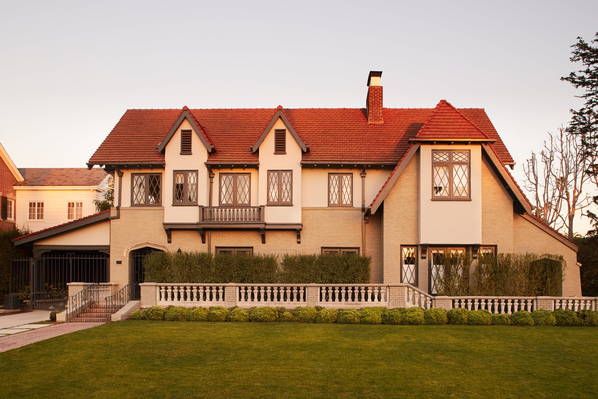
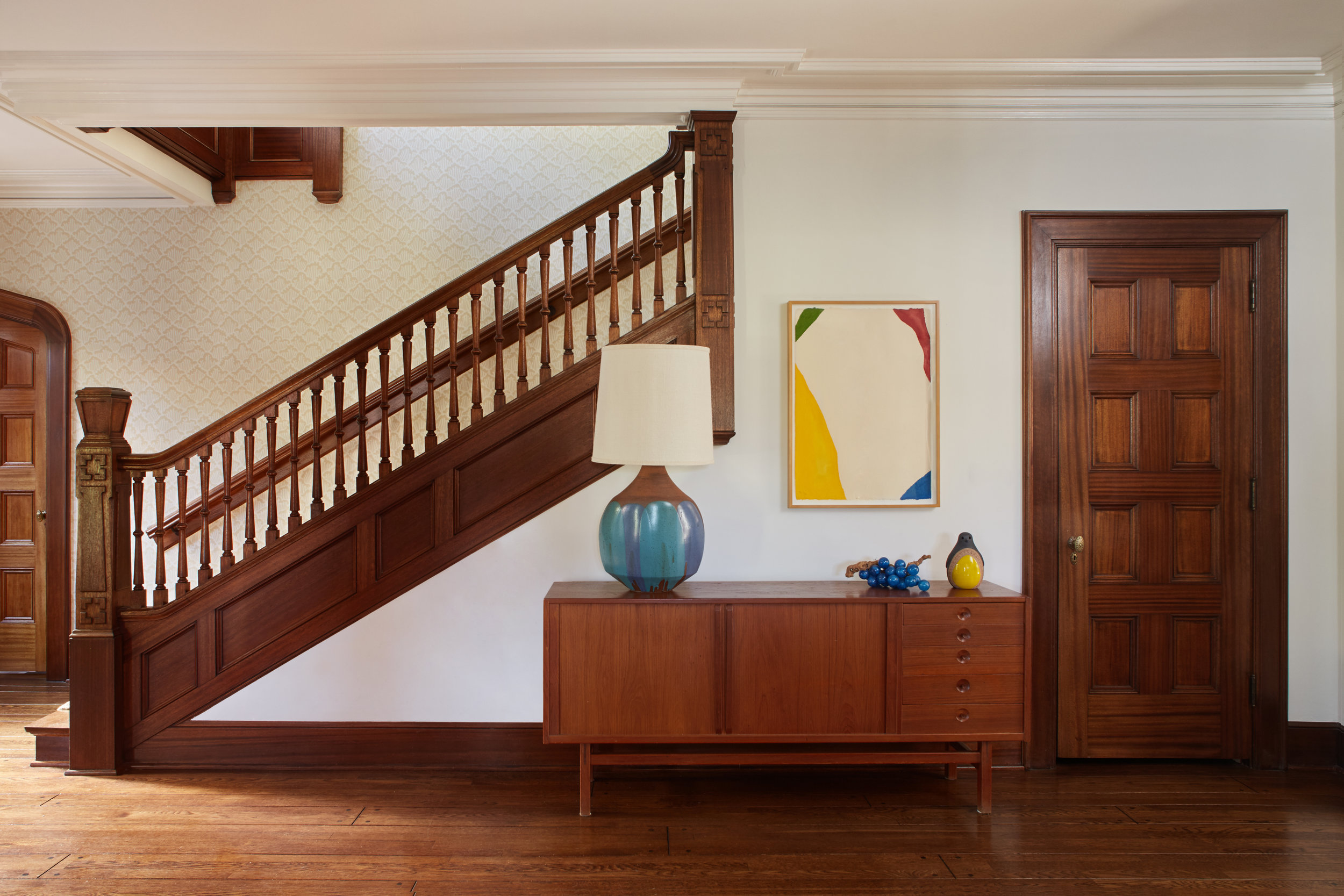
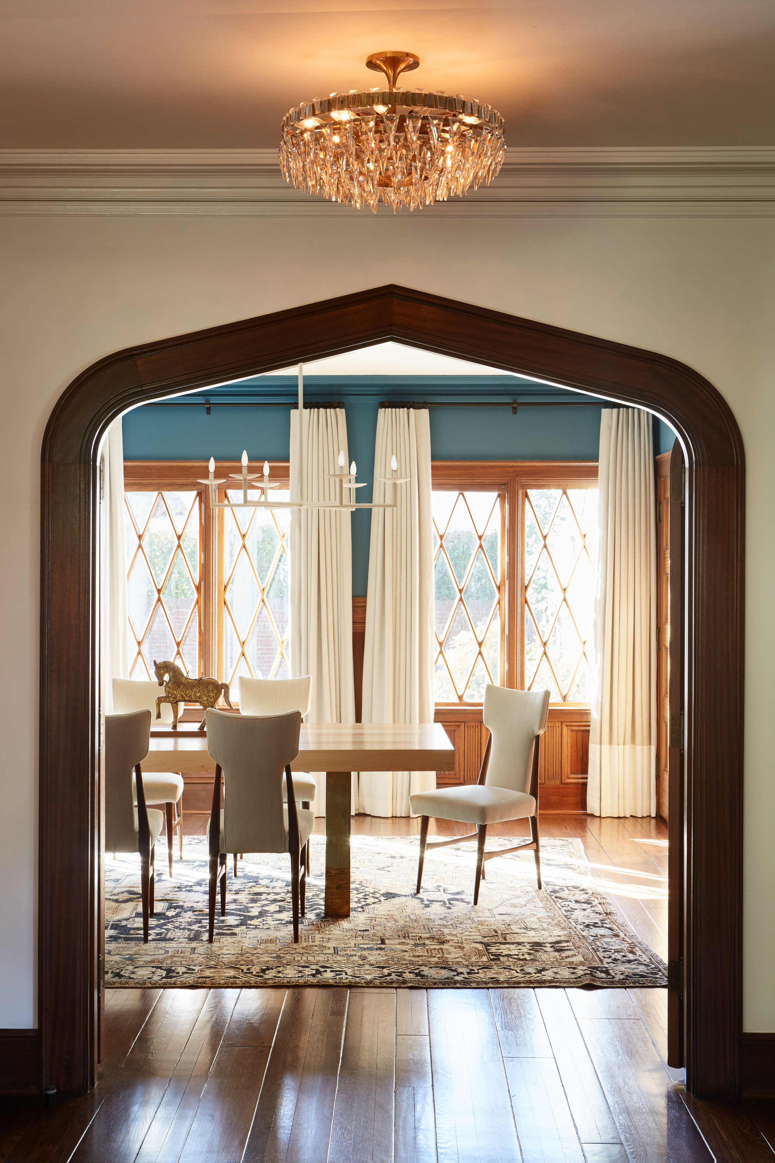
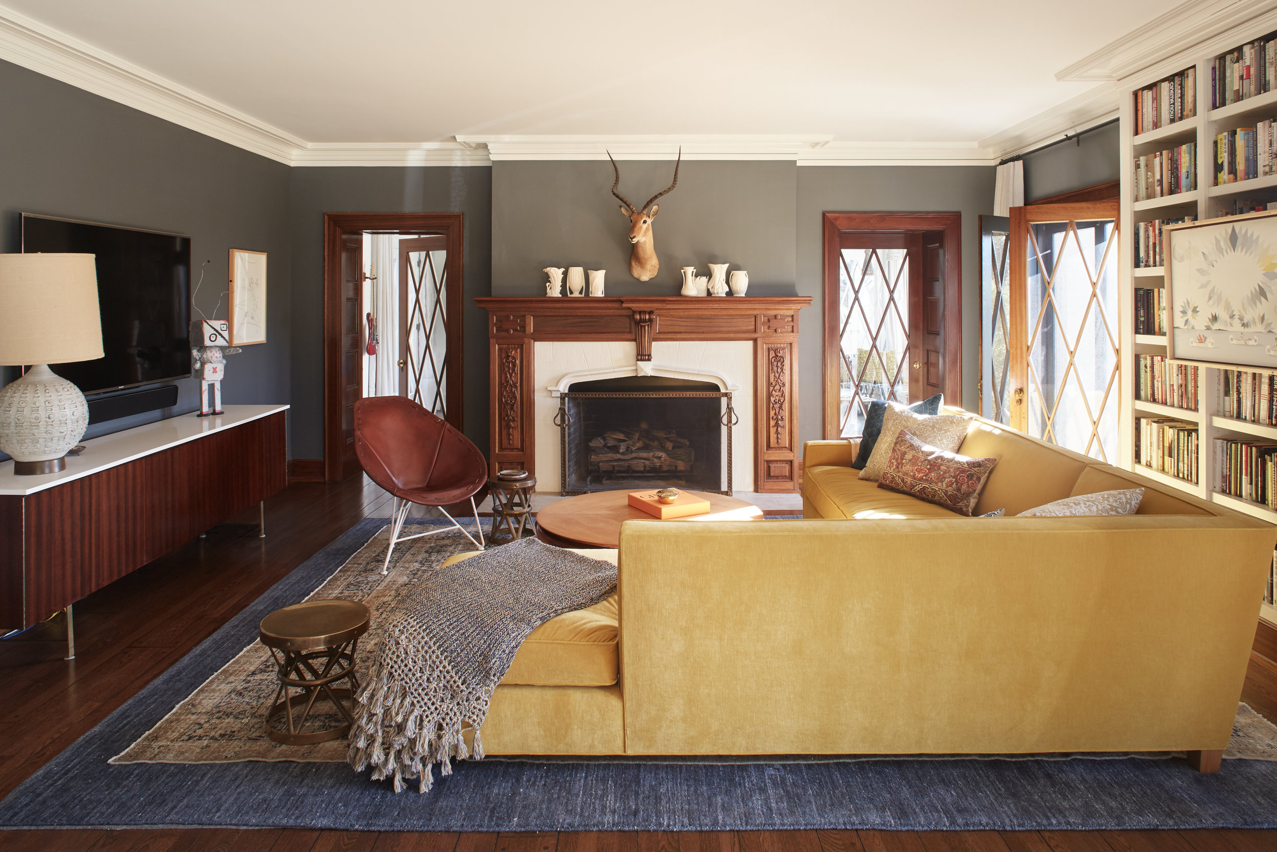
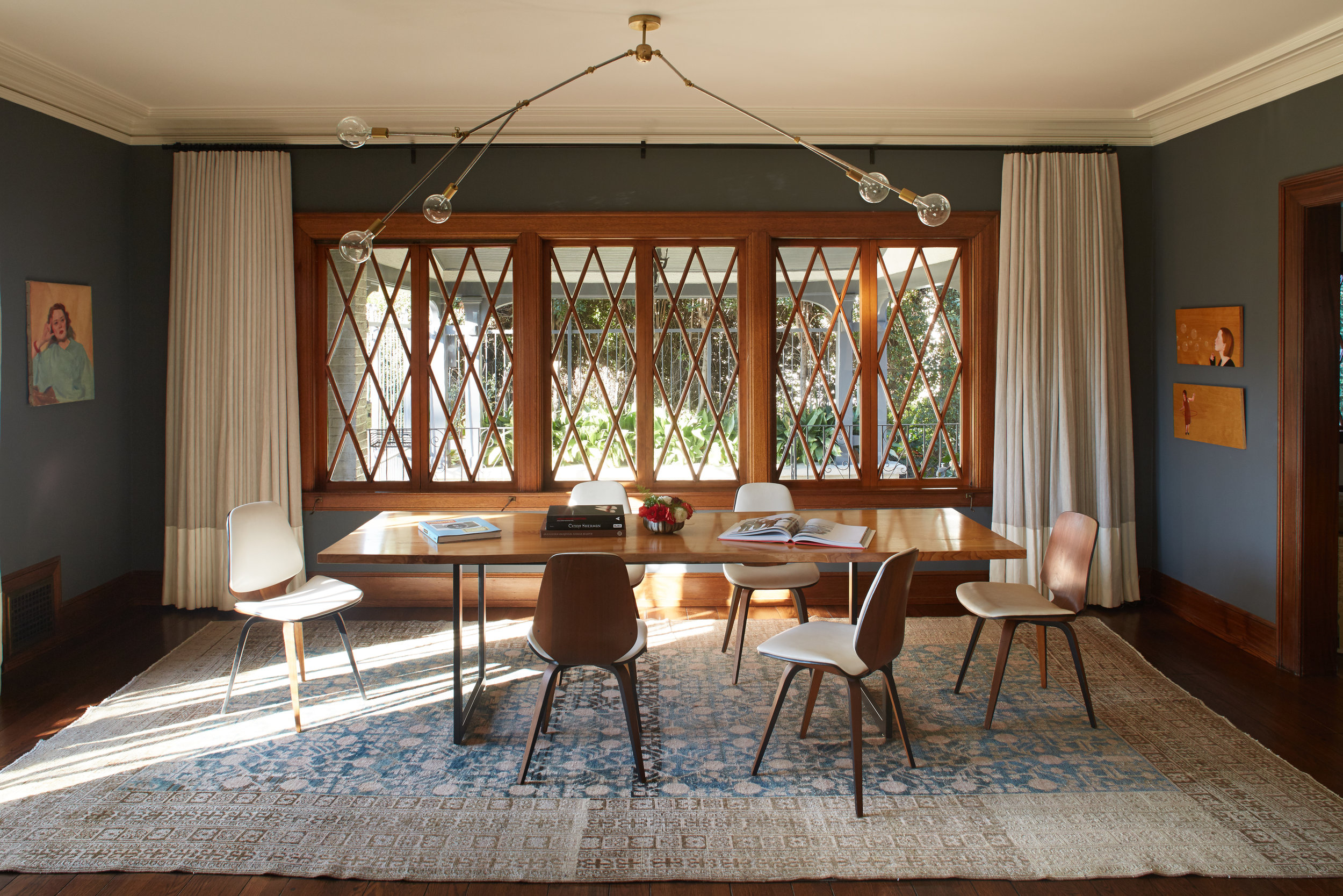
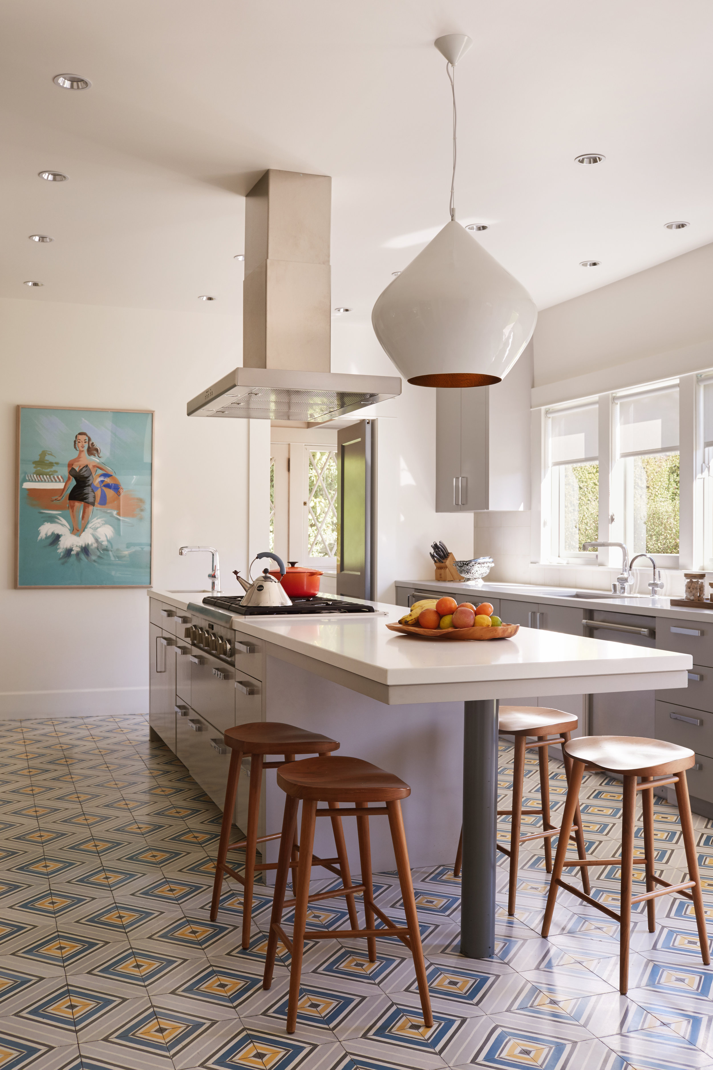
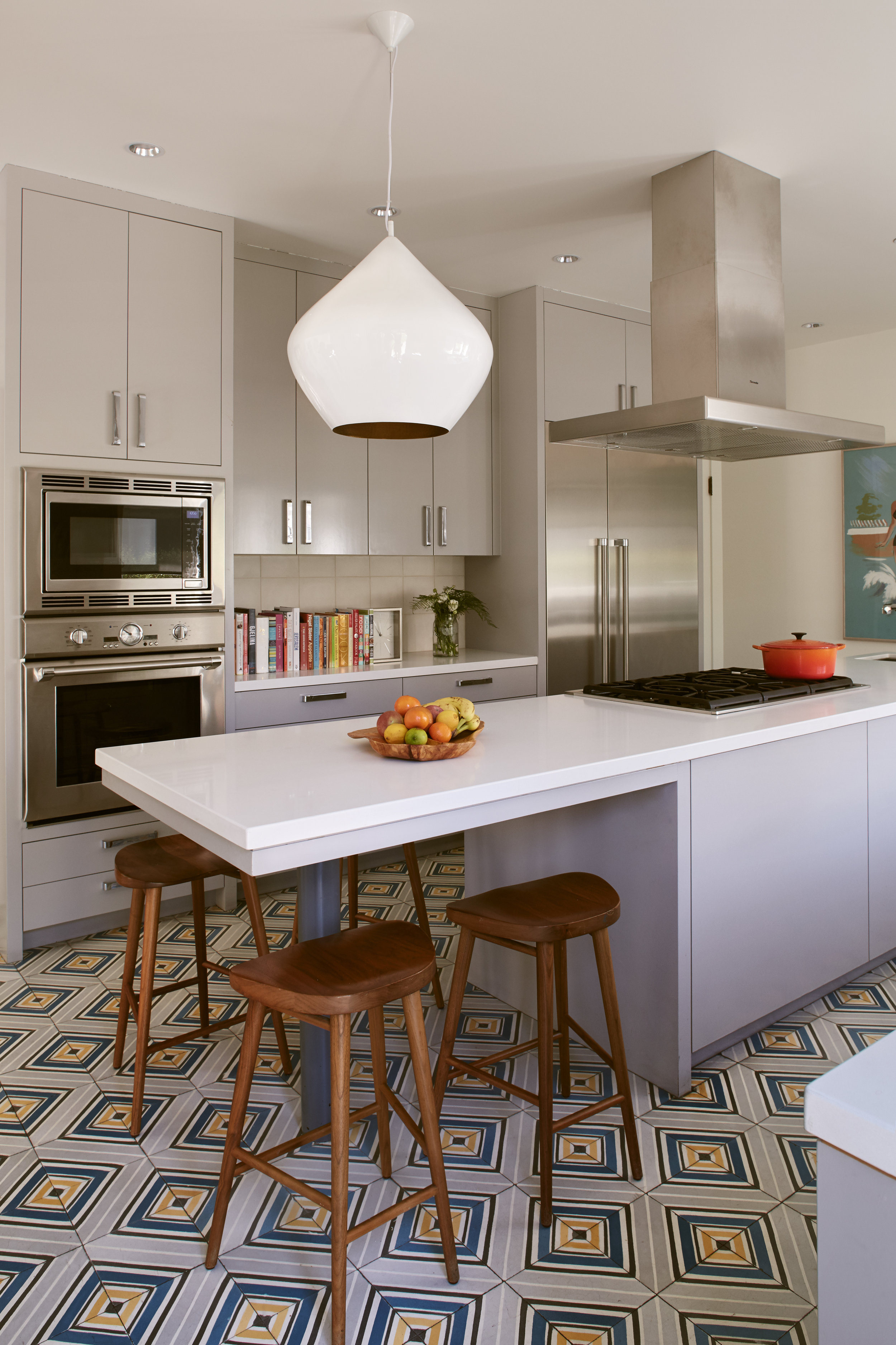
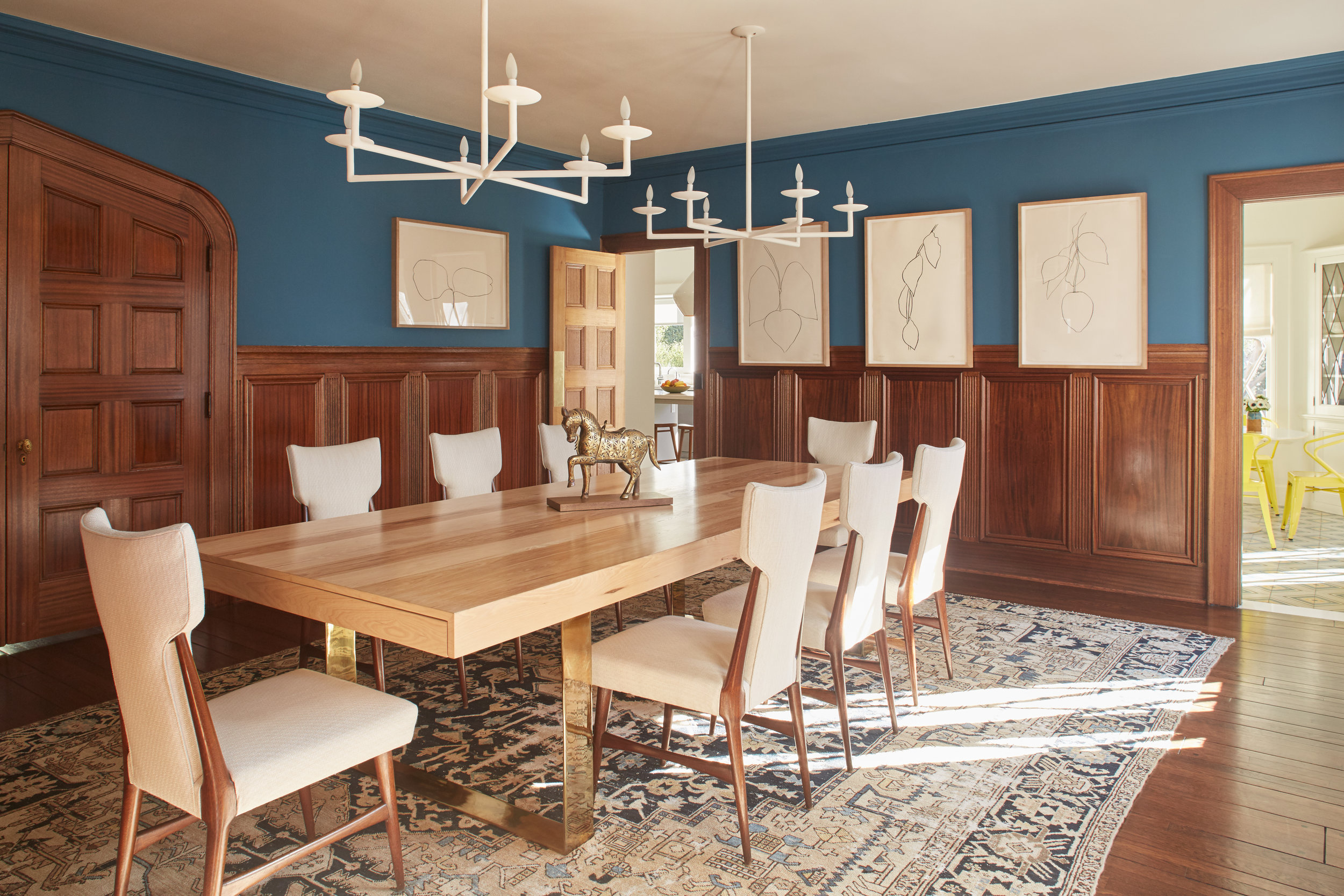
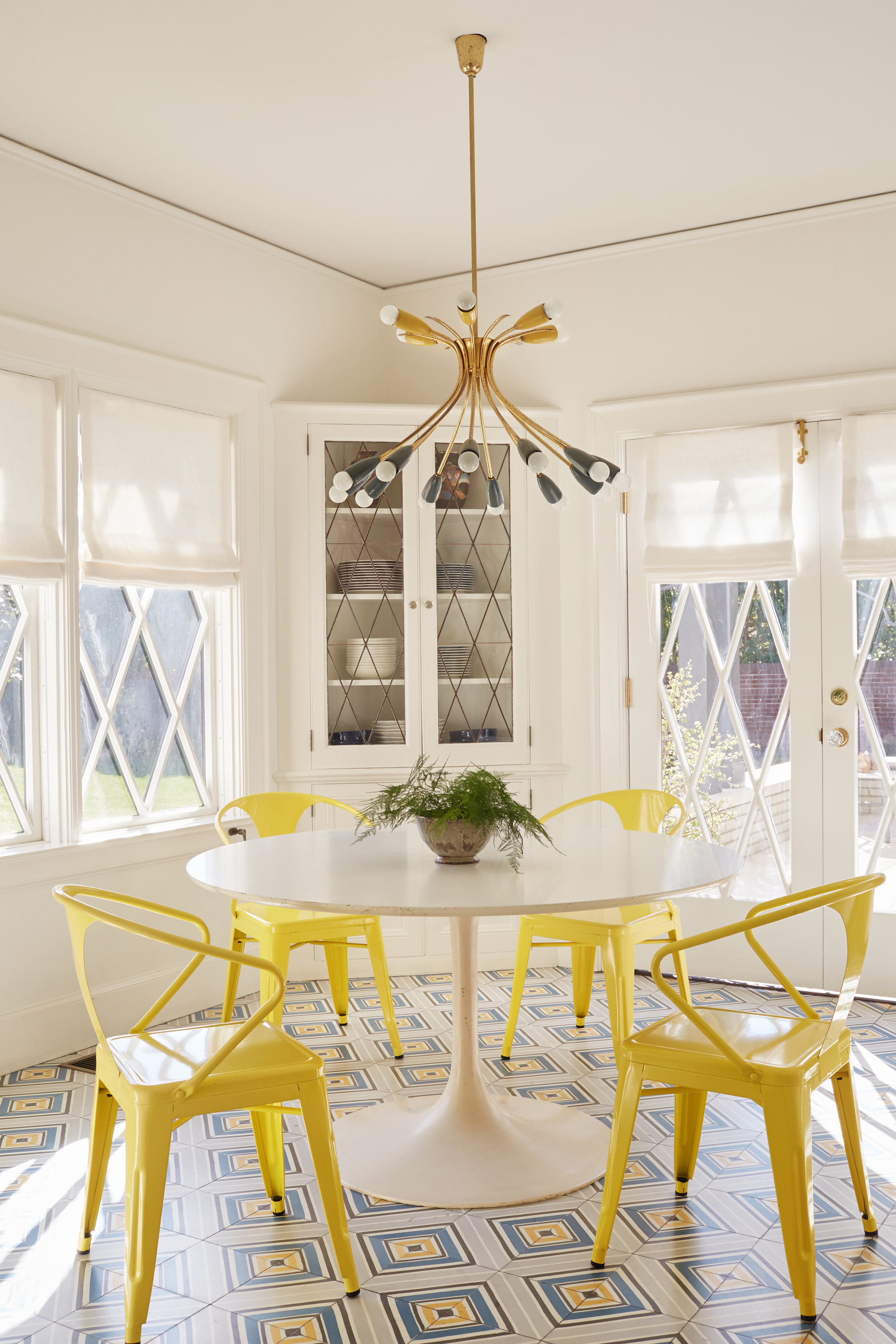
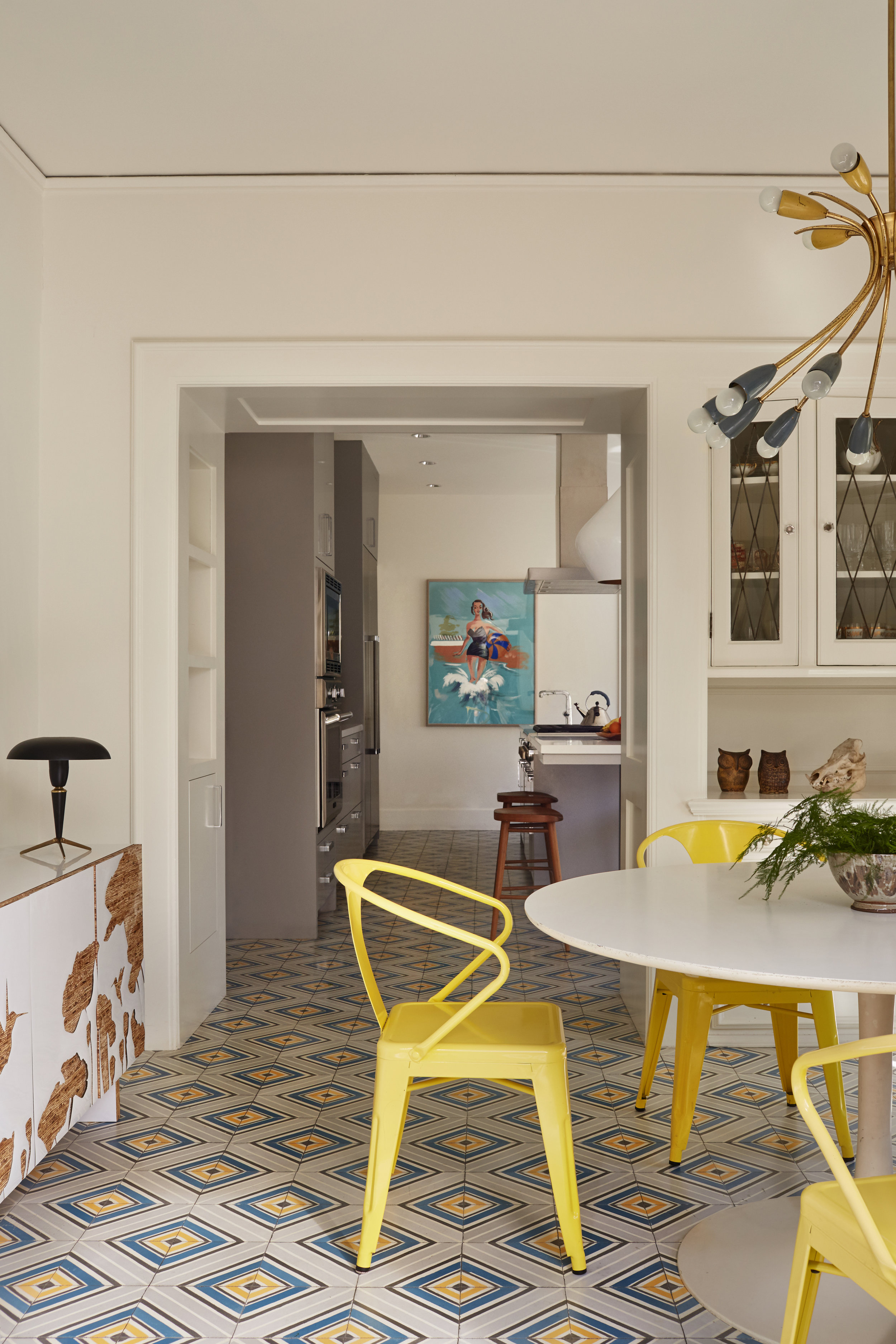
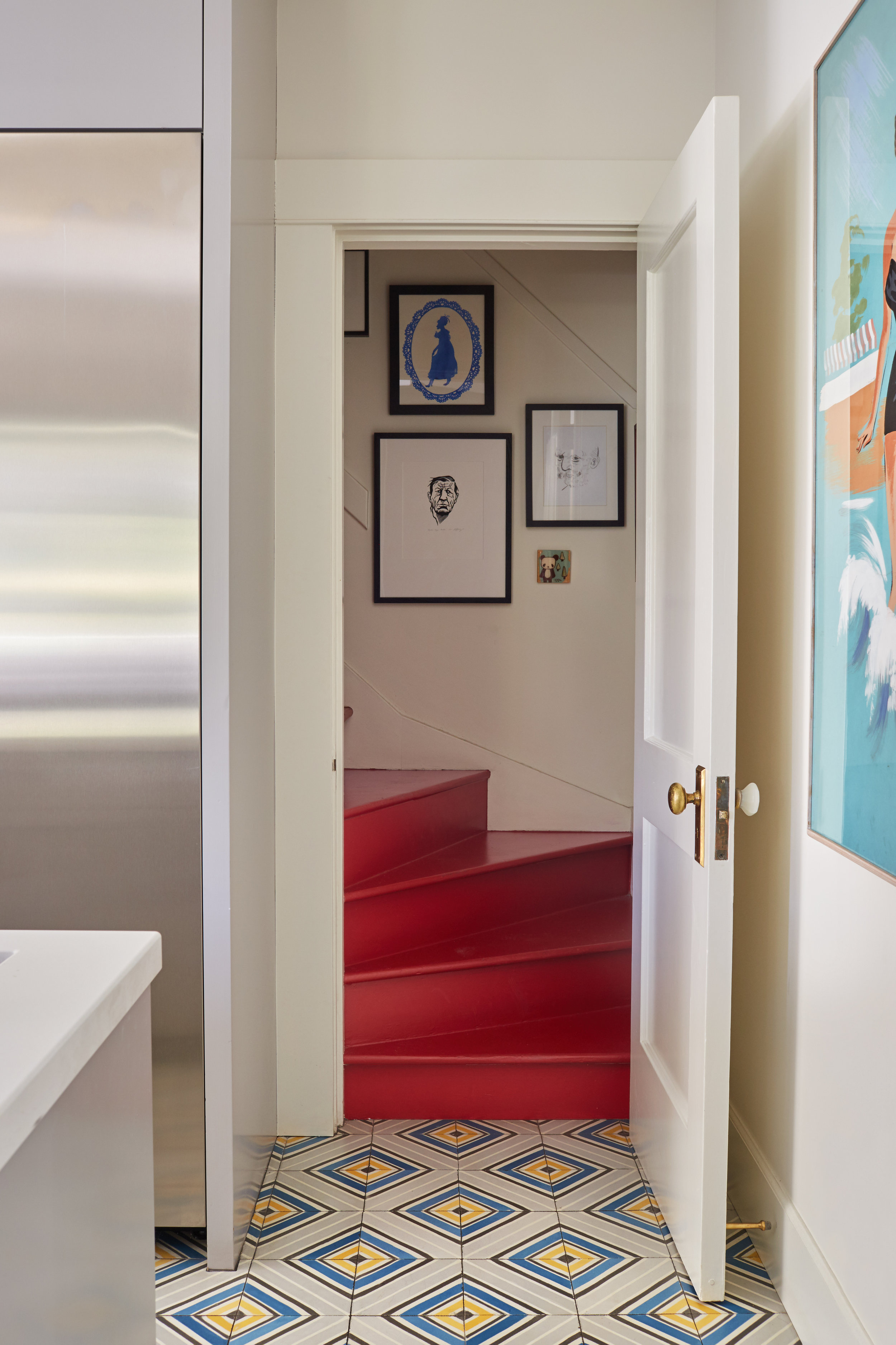
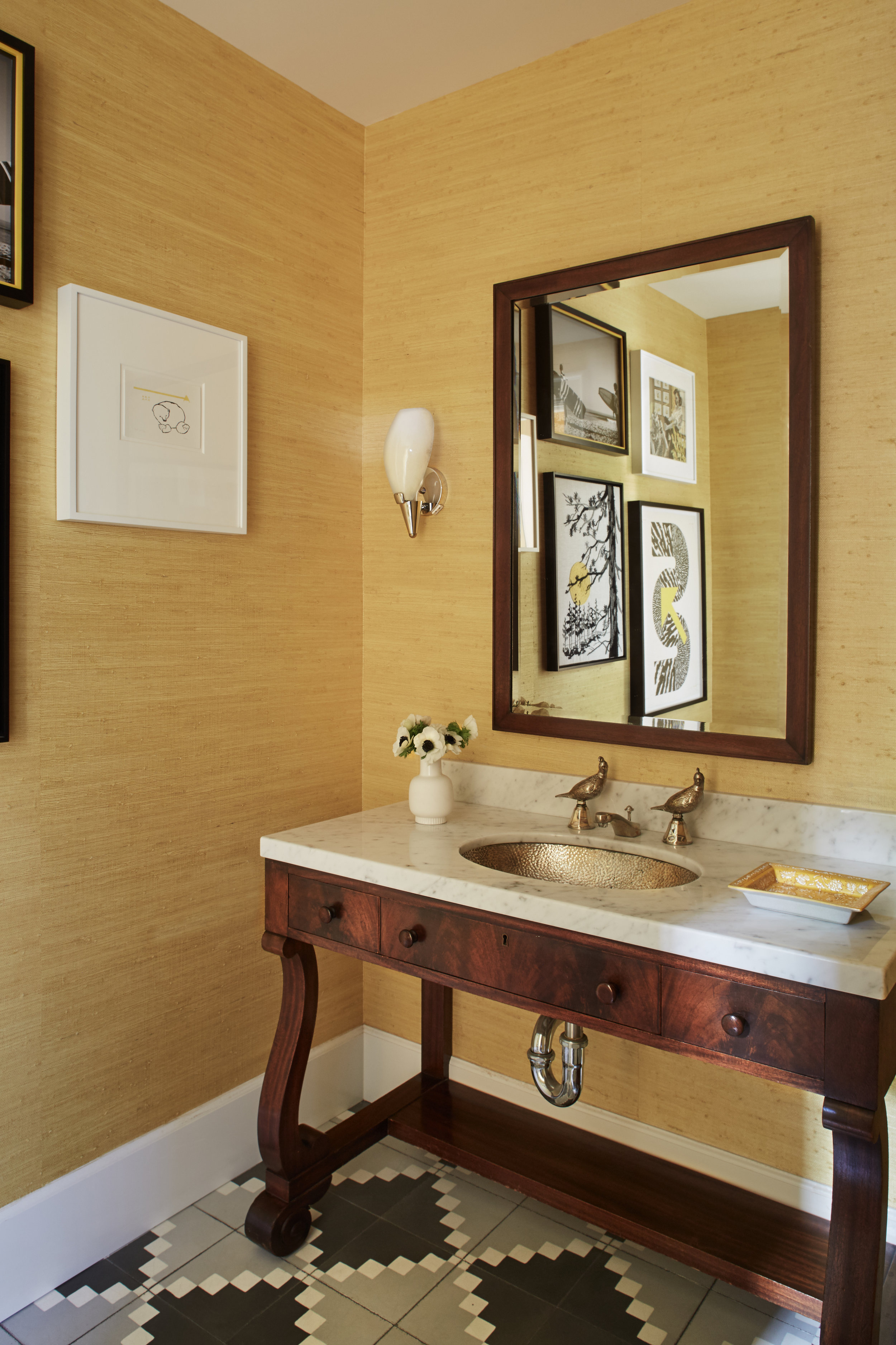
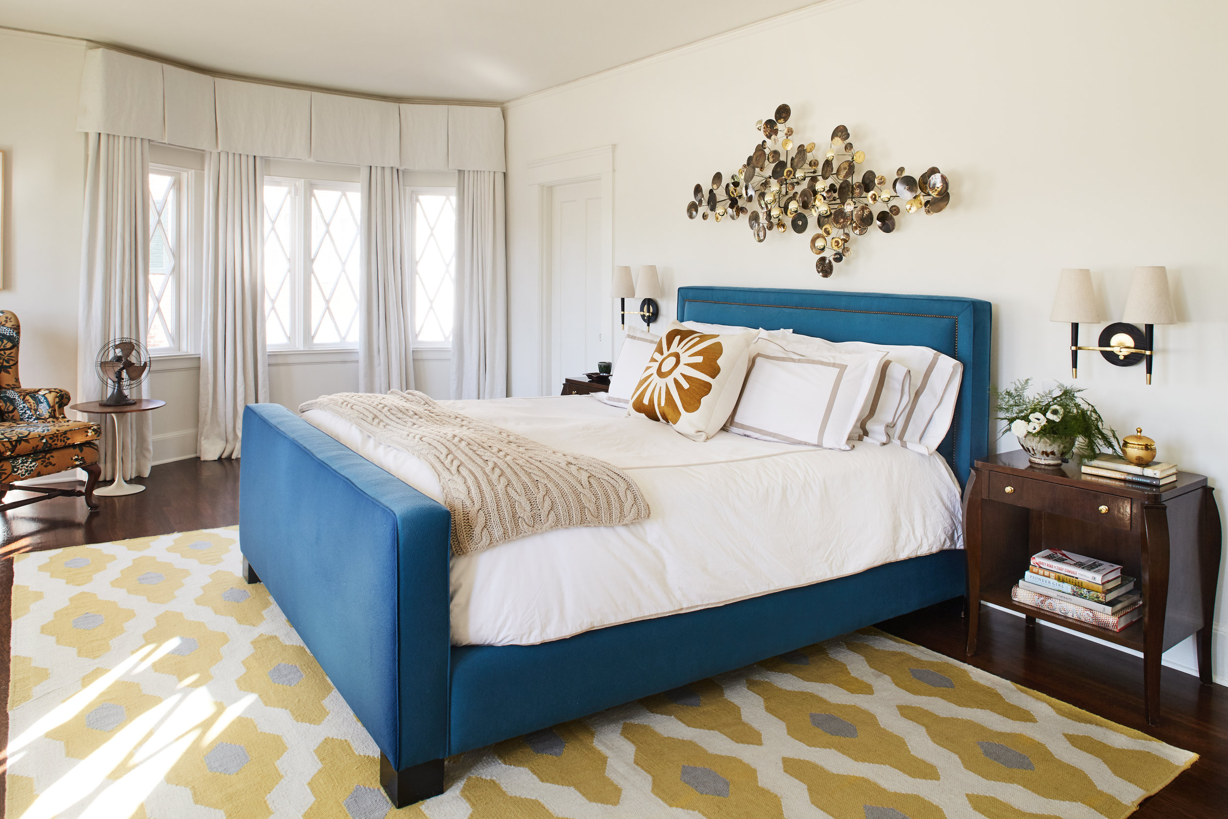
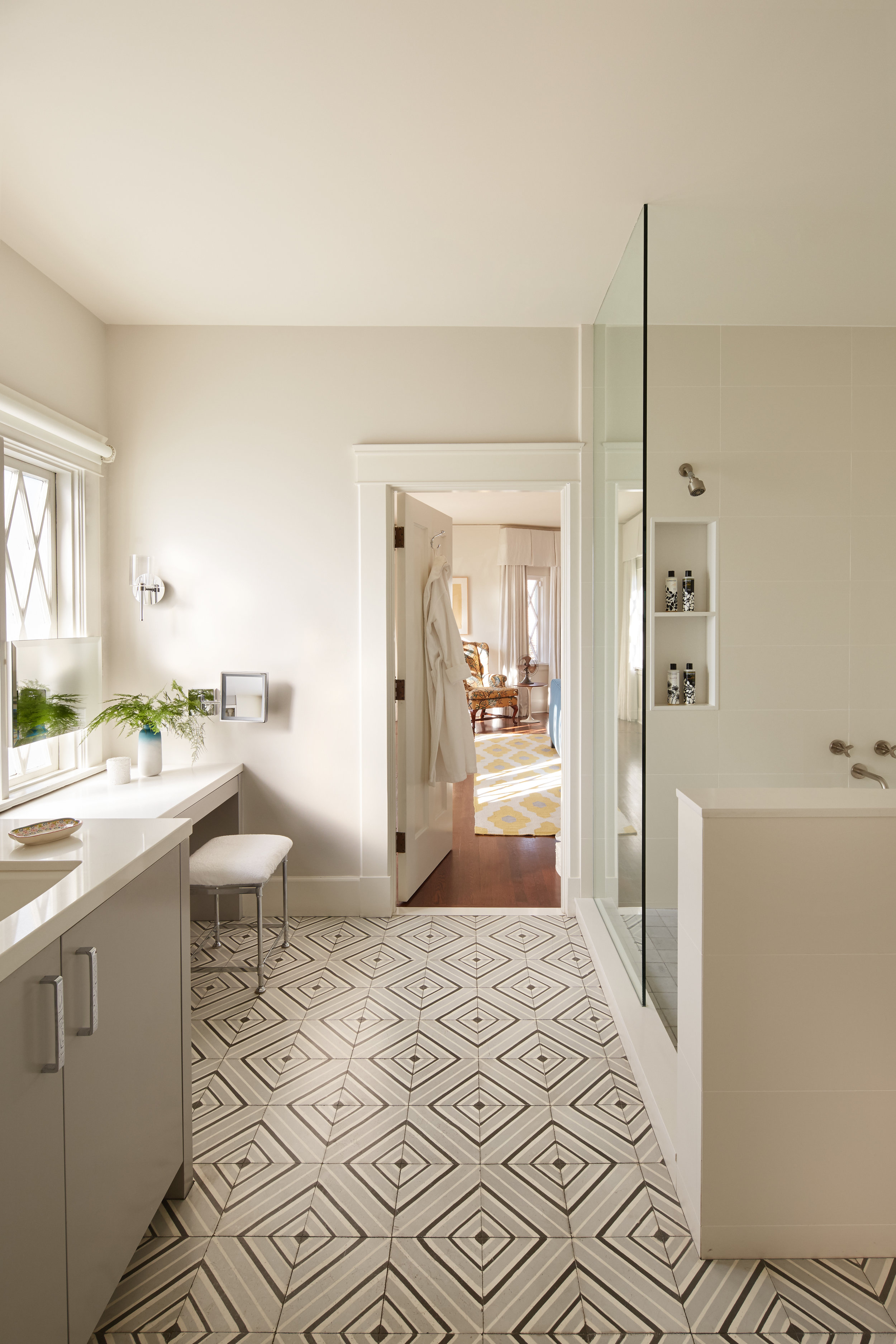
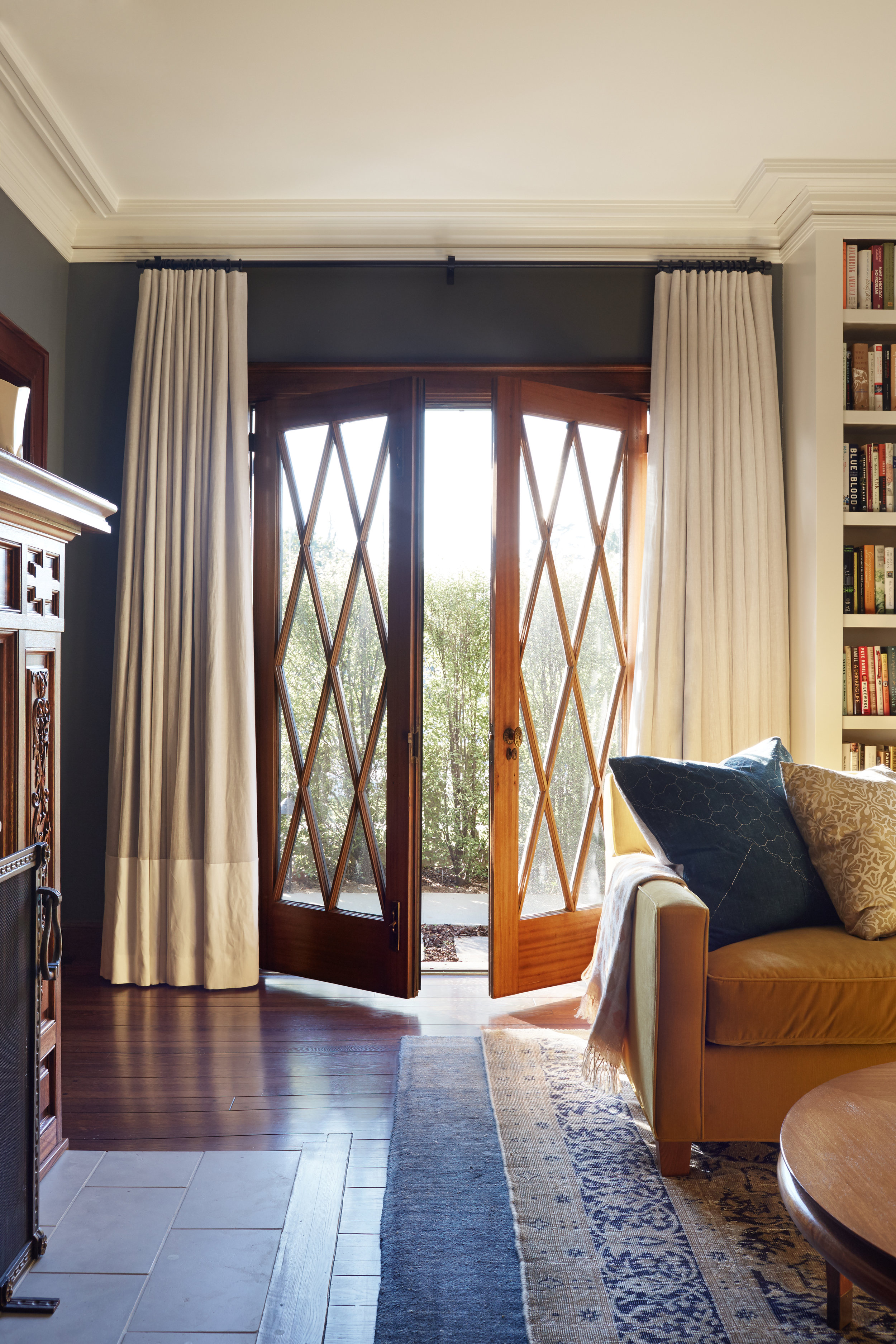
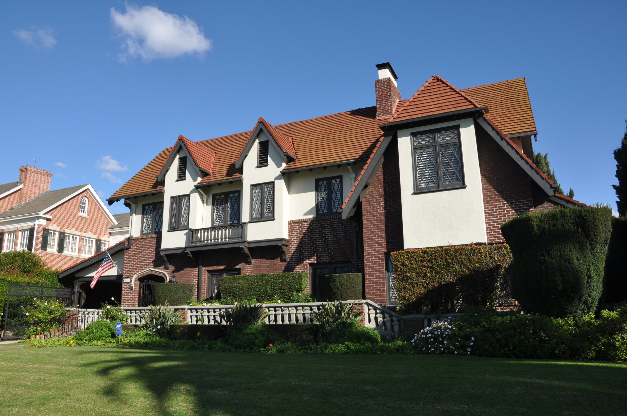
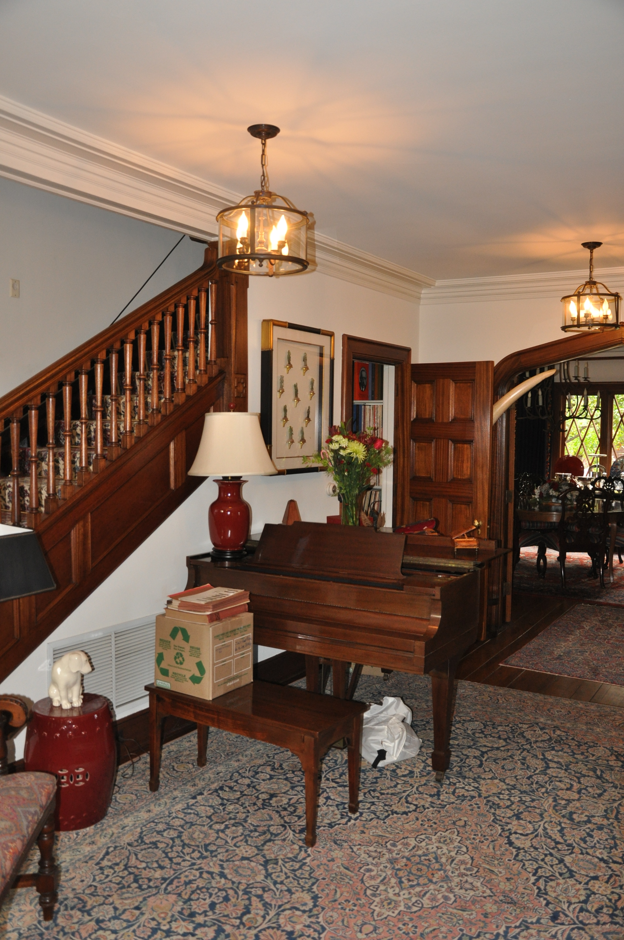
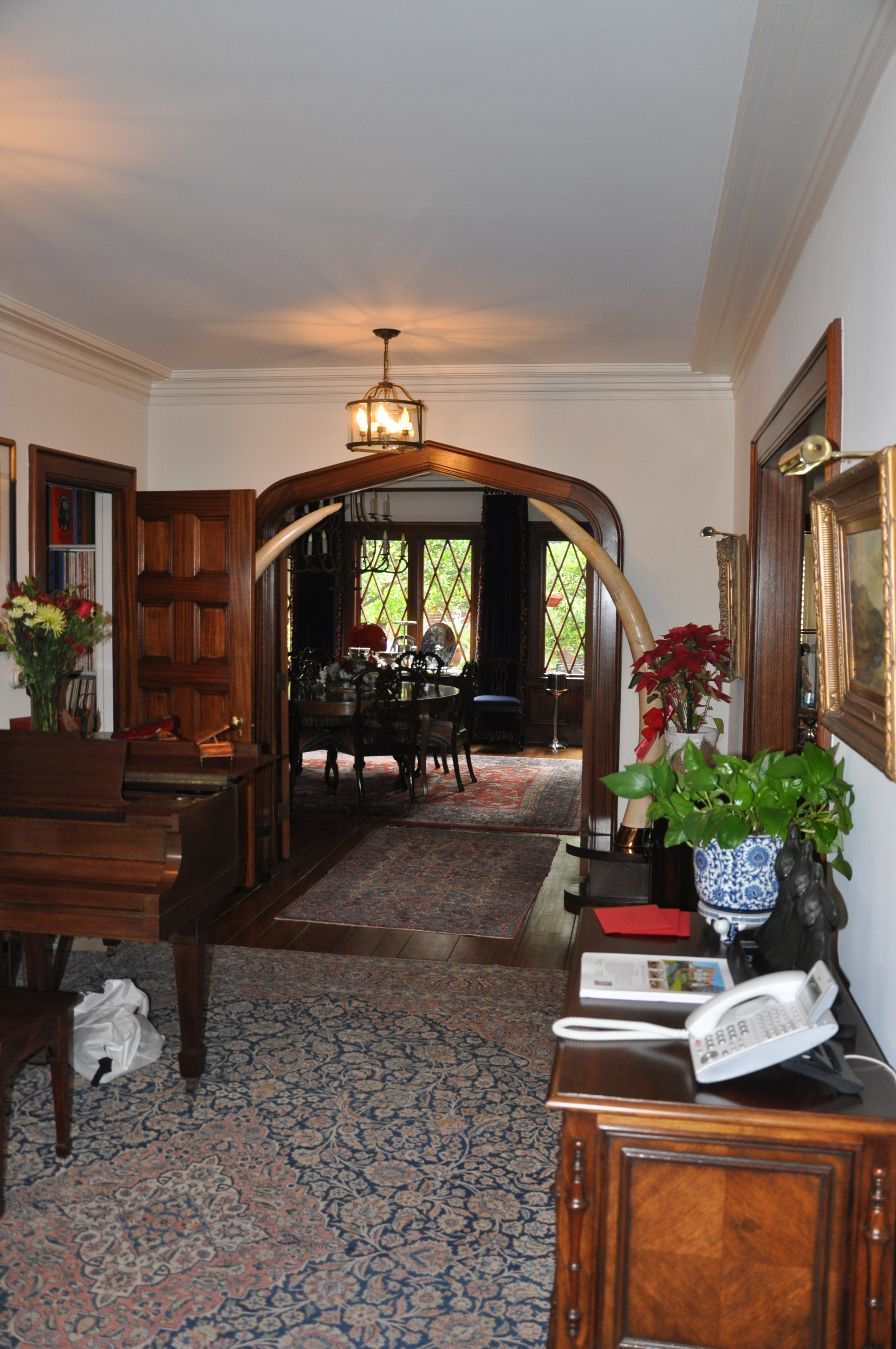
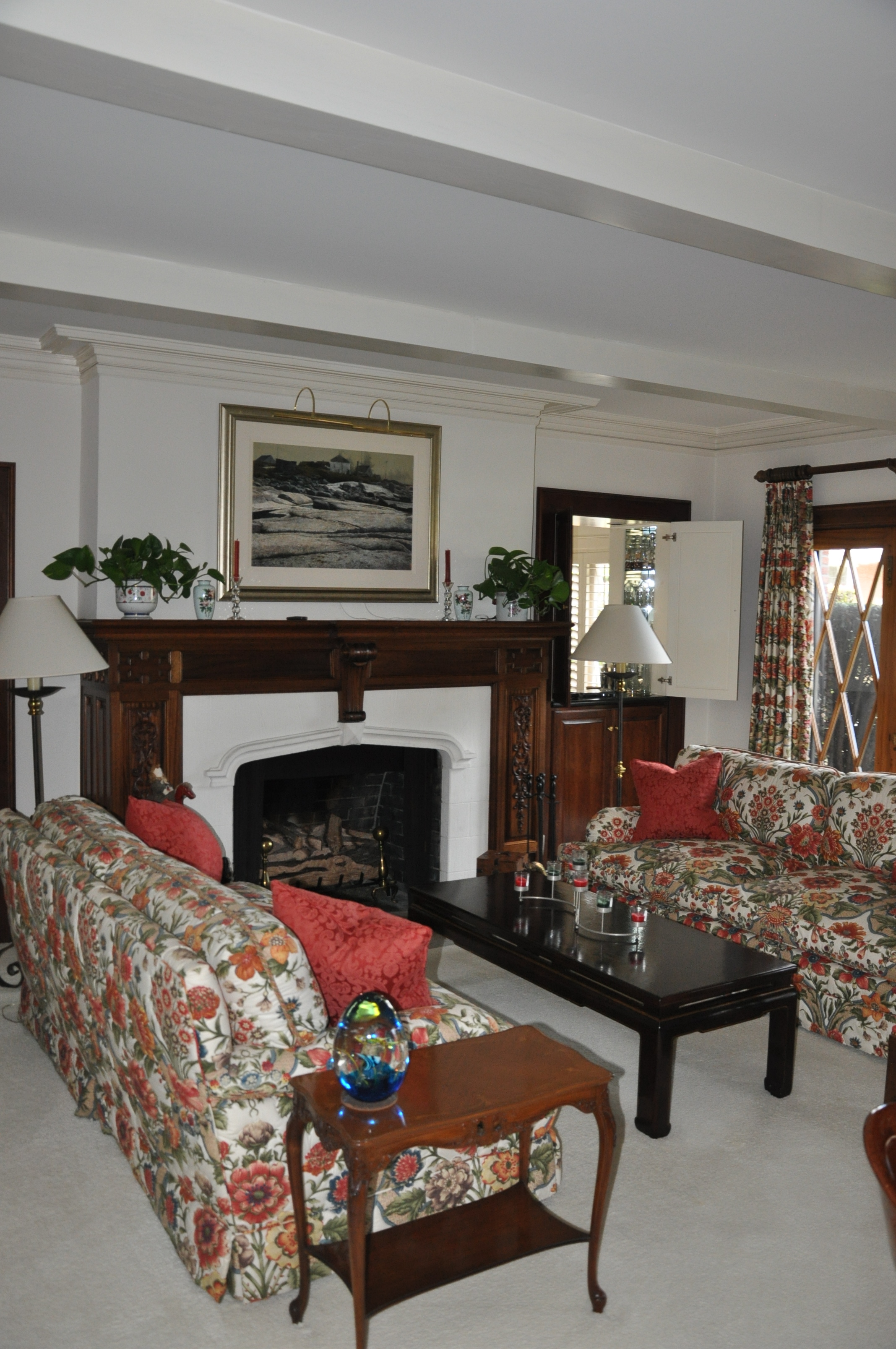
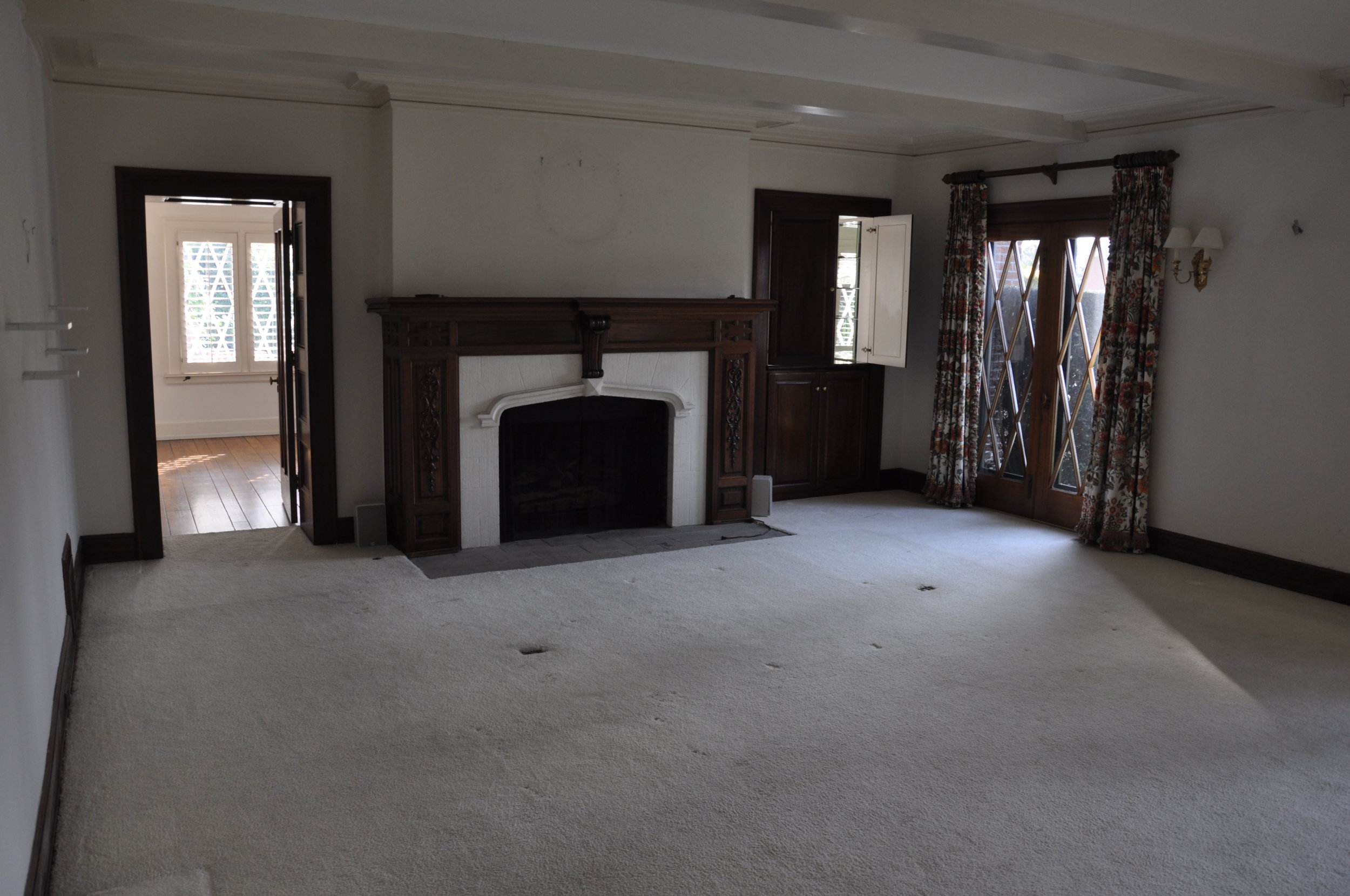
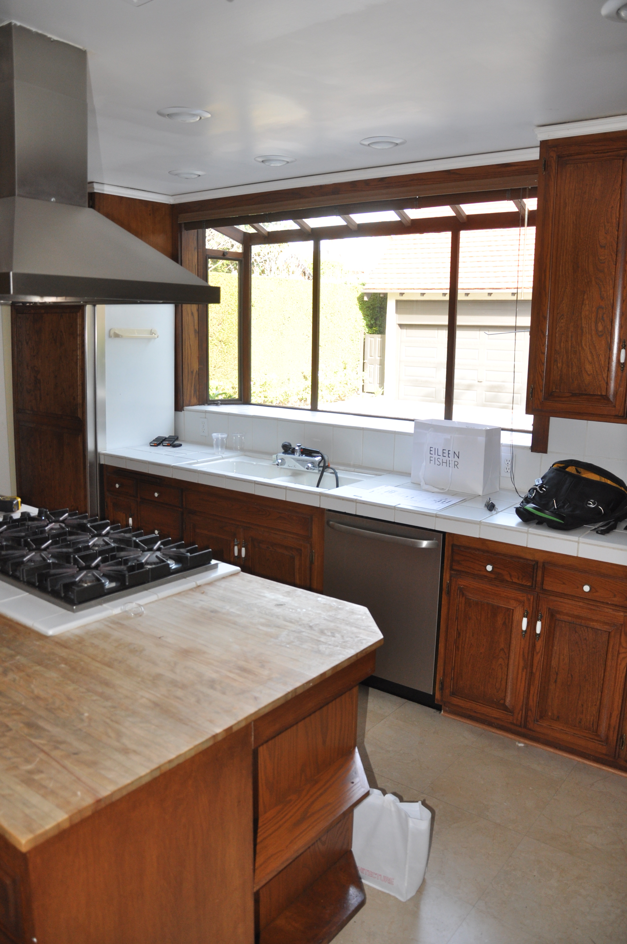
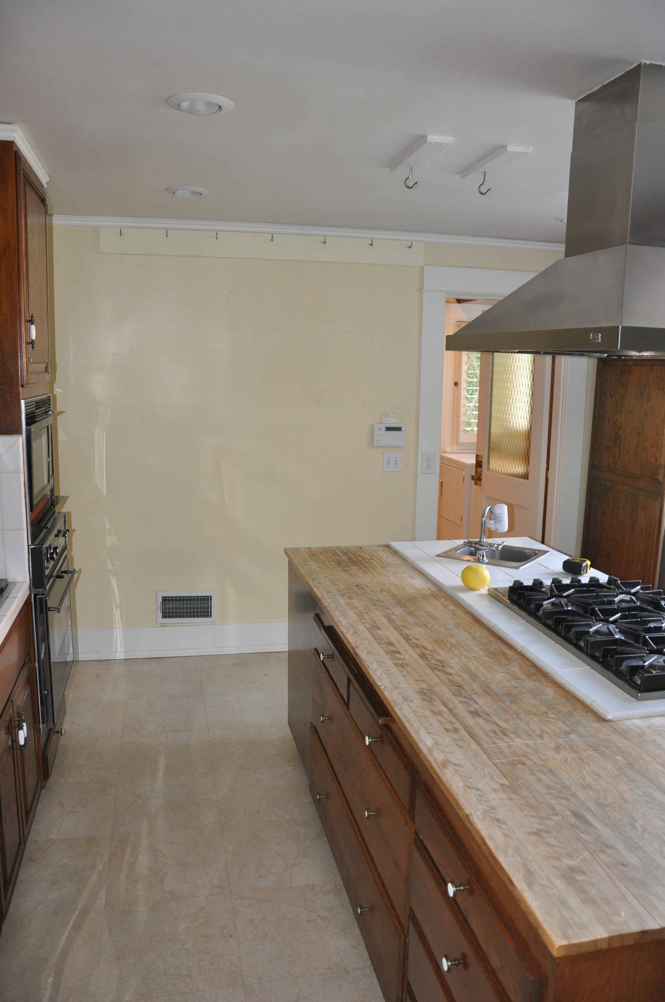
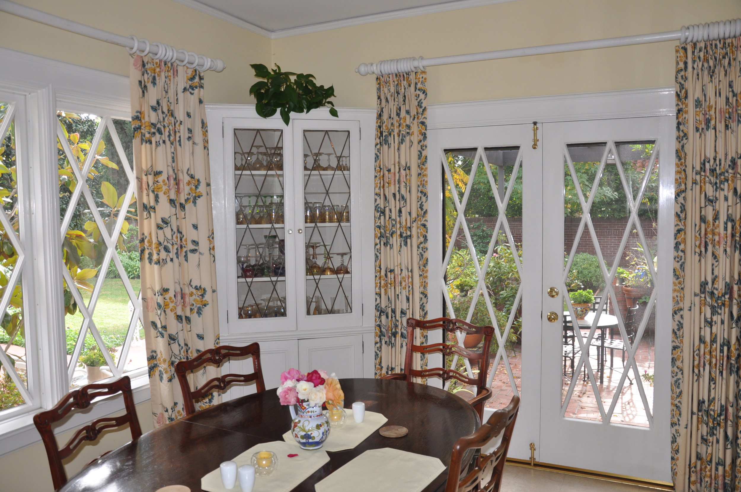
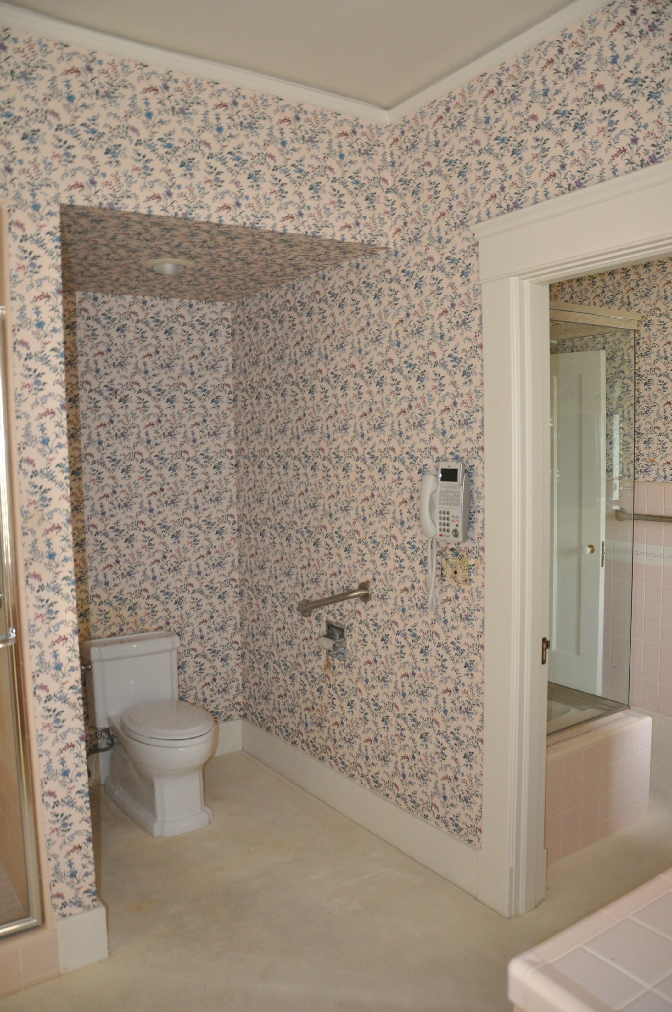
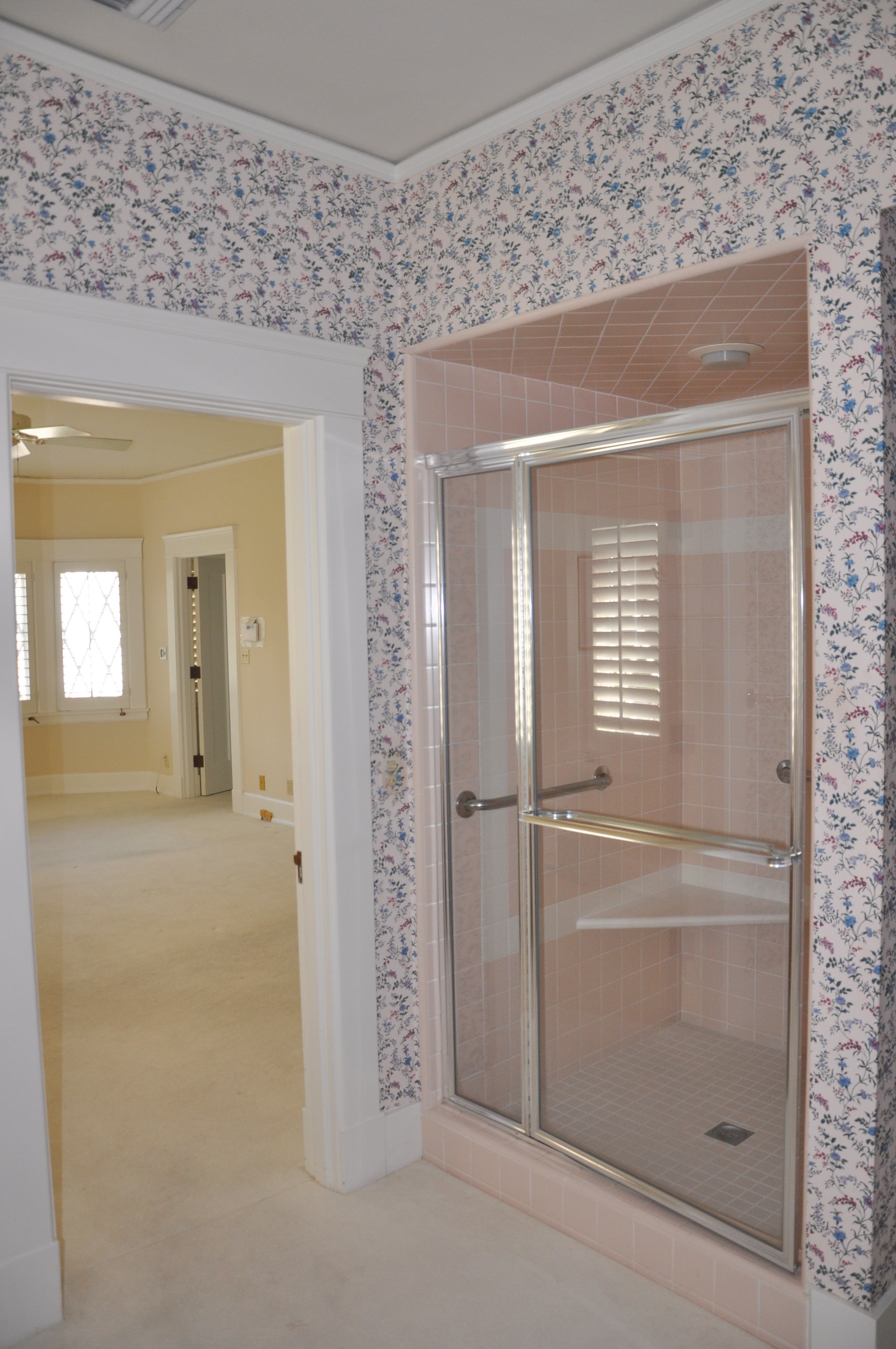
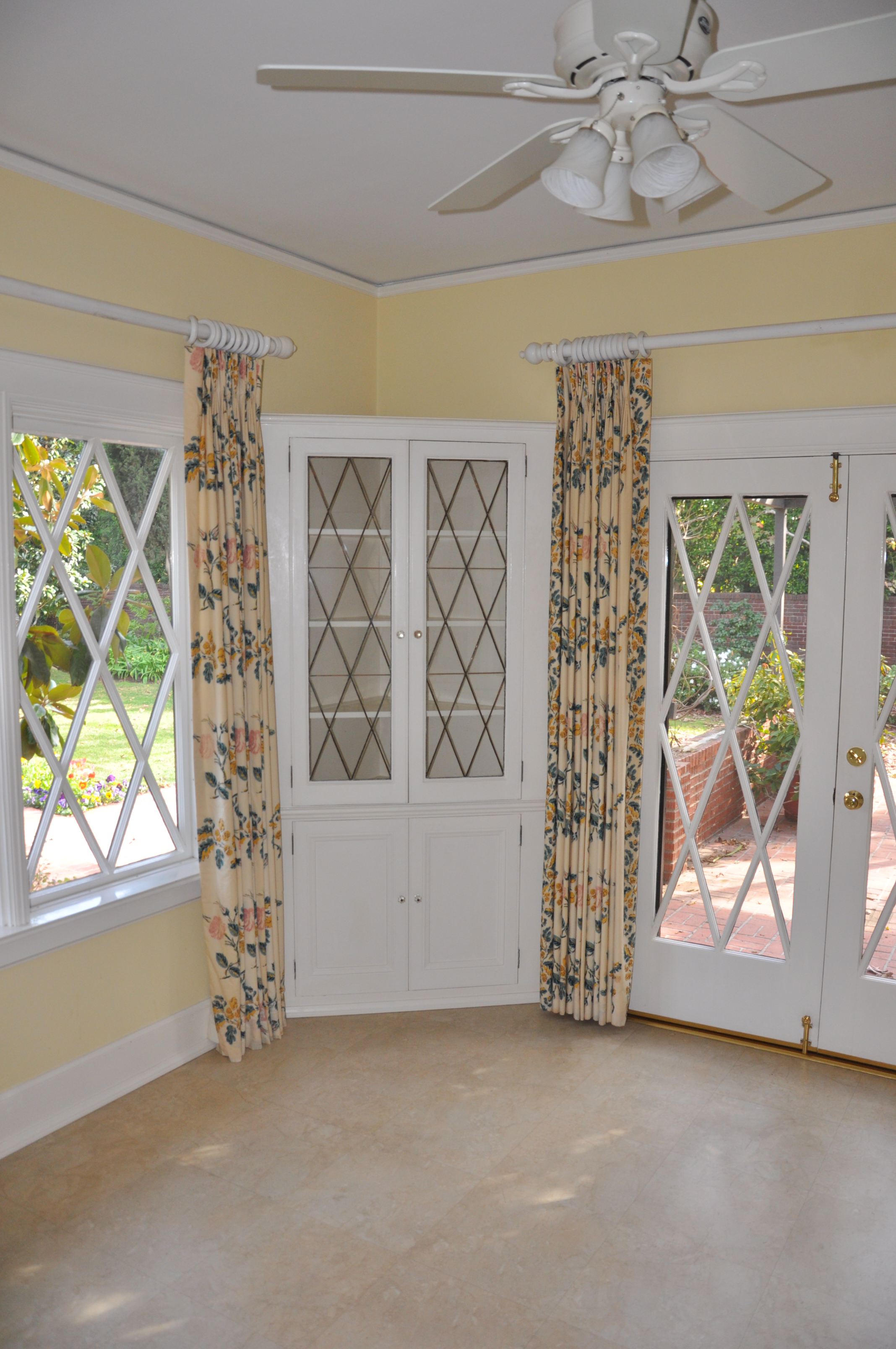
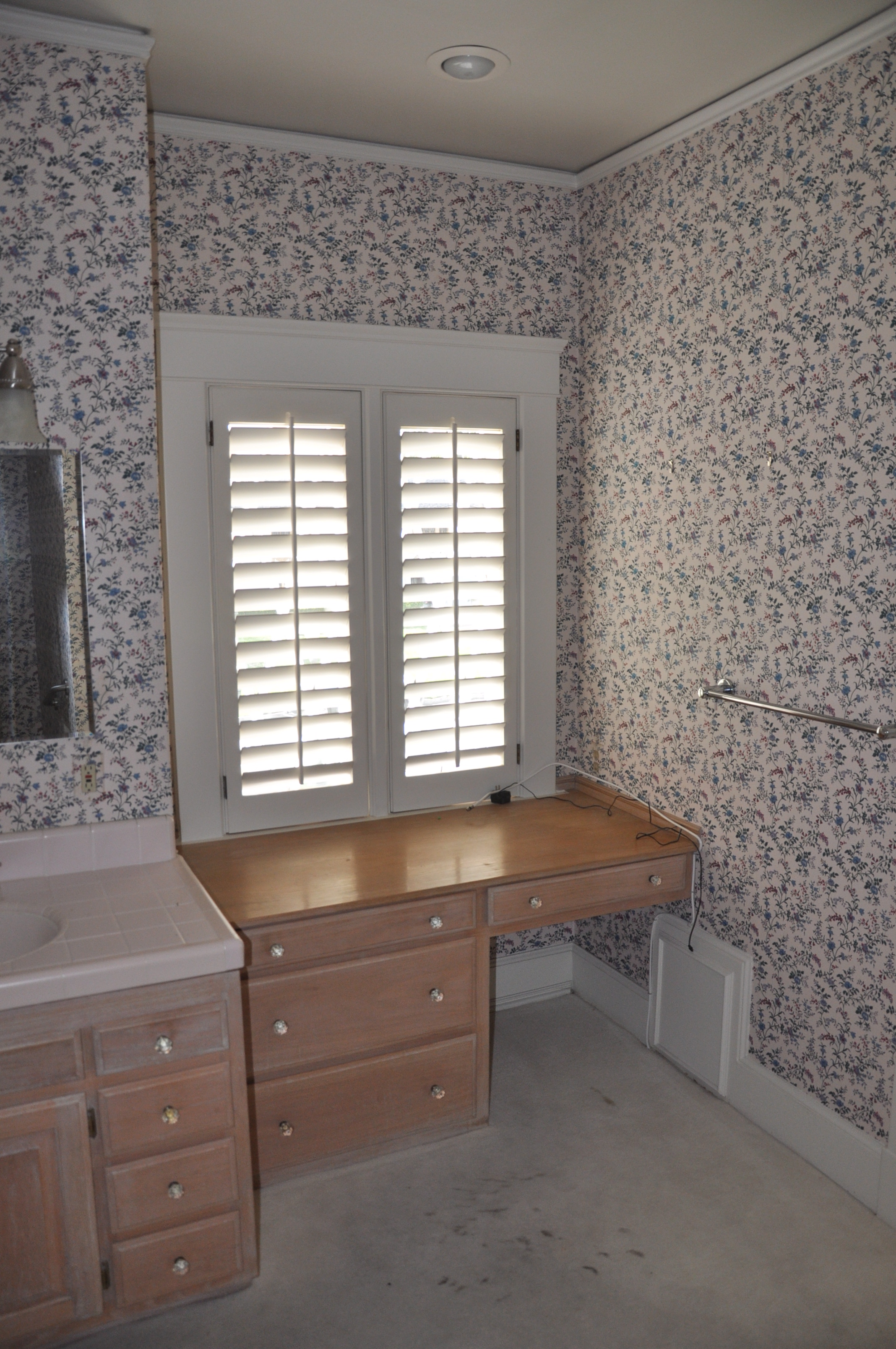
We are excited to share our 14 page spread in the most recent issue of Luxe Magazine July/ August 2017 Issue. Here are snippets of before and after photos of our recently published Windsor Square remodel and full home update. See below for before and after photos.
AFTER
BEFORE
JSA + Architectural Digest
JSA + CALIFORNIA HOME + DESIGN
JSA + LOS ANGELES MAGAZINE
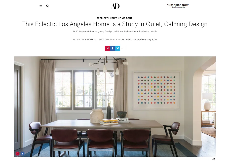
Tudor Modern
We are excited to share one of our recently completed projects, featured in Architectural Digest! Here are some of the hidden details our office executed to achieve this beautiful product.
Architectural Digest: Eclectic Los Angeles Home
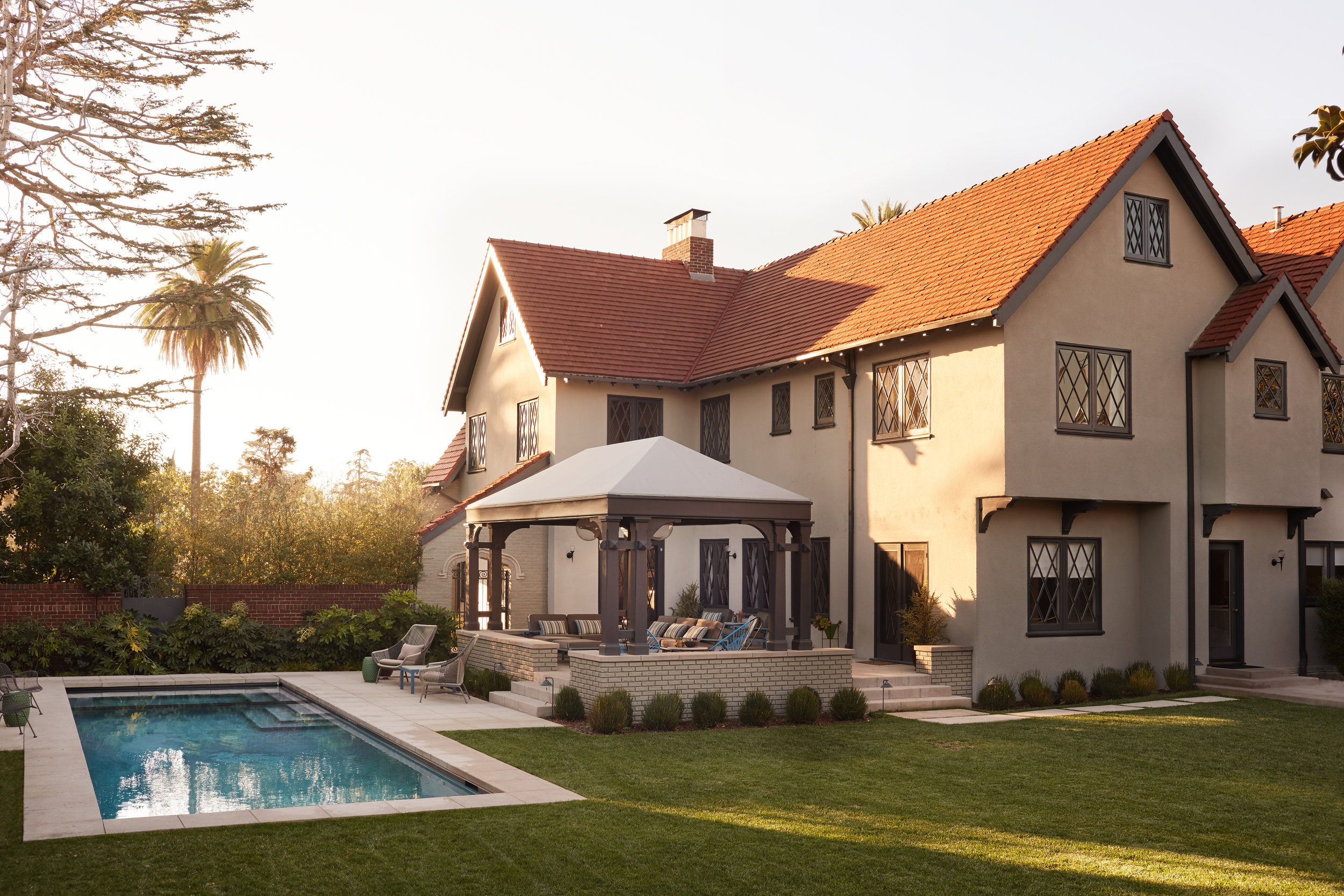
The goal for the project was to upgrade a 1920’s Tudor home for a modern family, and add on extra square footage for livable spaces and a new master suite. We were able to reconfigure the layout of the existing house to accommodate the living spaces that open out the back patio and yard, and use the addition as an architectural element that hosts the master suite. We designed a modern appendage that married with the form of the original traditional Tudor structure, while accentuating the hierarchy of the new master suite space. In order to fit the pool on site, our solution was to locate it against the new addition, giving it the ability to visually function as a water feature, as viewed from the master bedroom. To pull of the design, there were a couple crucial details we kept our eye on.
First, in order to keep the form of the addition pure, we had to remove used built-in gutters to collect the water from the new roof.
We also allowed for a deepened threshold, so it could be used as a seating ledge from inside the house.
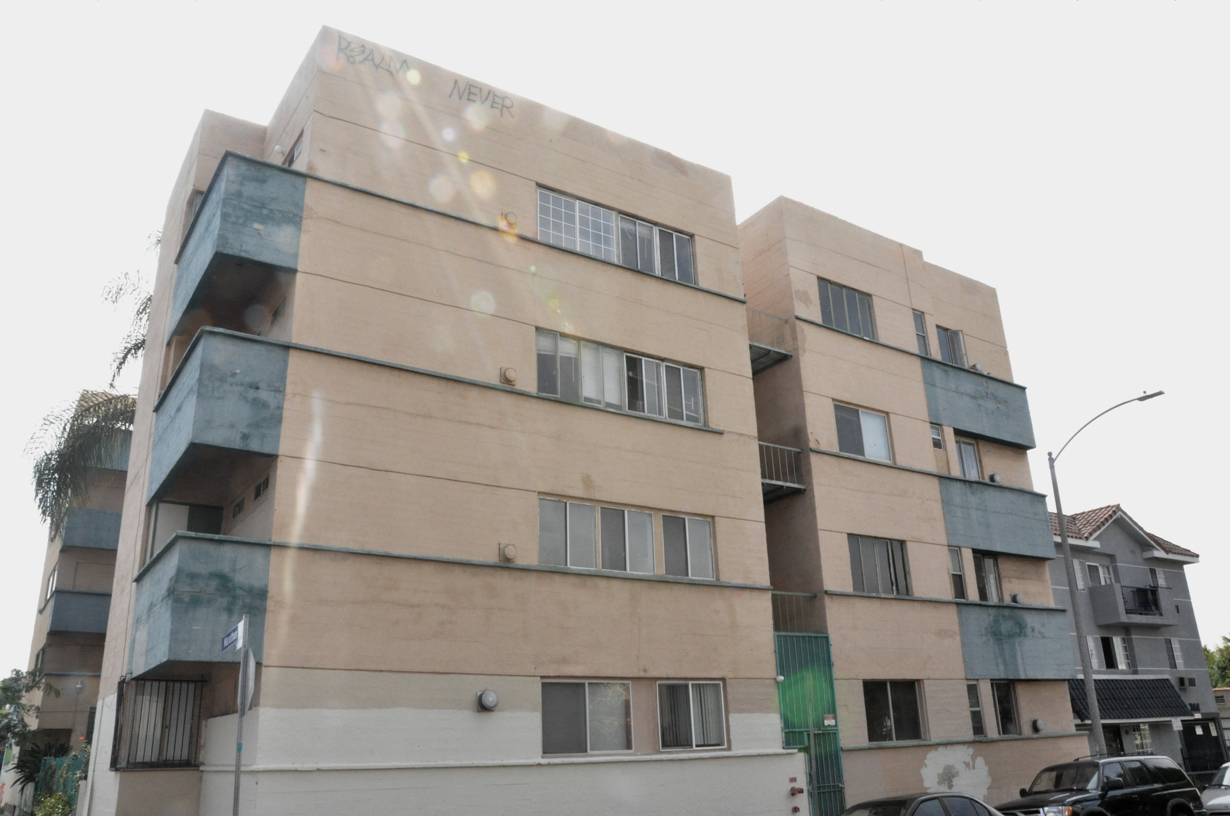
Jardinette Revival
We have recently started work on bringing new life to a nearly forgotten LA gem: The Jardinette Apartments. Built in 1928, it was the Richard Neutra’s first US commission, and his first mark of modernism and International Style in America. Utilizing a reinforced concrete shell as its primary structural element, it was truly a foreign and unique object among the wood-framed construction which stamped the LA landscape. The apartments were designed for the urban dweller, focusing on efficient use of space and storage, taking advantage of every square inch. The large steel windows were designed to provide ample daylight, and look out to the central garden, after which the “Jardinette” was named.
Through the years, the building has become dilapidated, but while some of the original features were stripped away or replaced, there are still many cases of original details that make this building unique. Due to the fascinating history behind the structure, it was designated as a Los Angeles Historic-Cultural Monument in 1988. Partnering up with Clippinger Investments, Barbara Lamprecht, and Nous Engineering, we are working to restore this structure for a new generation of modern urban dwellers. Stay tuned for updates.
John Muir Middle School Debuts Outdoor Learning Space
Burbank Leader October 21, 2016
The Agency for Civic Engagement(ACE) Center empowers students to improve under-served communities through architecture,design, business, and interdisciplinary skills. Students work collaboratively across disciplines to combine their skills and test their fields of study on real projects for the public good.
By Mark Kellam Contact Reporter
A new outdoor classroom was dedicated on Friday at John Muir Middle School on a site where a condemned bungalow had previously been located.
The 40-seat, 2,000-square-foot classroom is the result of a partnership the school formed with Woodbury University's School of Architecture and Nickelodeon.
Led by Woodbury professors Jeanine Centuori and Oscar Corletto, a group of nine upper-class students in the architecture school conducted interviews with
Muir teachers, staff and parents to see what they envisioned for the space, according to school officials.
Starting this past January, the Woodbury students began building the walls, stage and seating for the classroom.
In May, as part of Nickelodeon's "Viacommunity Day," more than 50 volunteers from the company dug holes as well as planted hedges, trees, greenery and filled the space with more than 25 cubic yards of mulch.
http://www.latimes.com/socal/burbank-leader/news/tn-blr-me-muir-outdoor-classroom-20161019-story.html
A bus stop built by People for Urban Progress in Indianapolis.
When Sustainability and Sports Fandom Come Together
A shade structure built by People for Urban Progress, along with design and community partners, in the Highland Vicinity neighborhood of Indianapolis.
People for Urban Progress installed seats from Bush Stadium at bus stops around Indianapolis, more than doubling the number of bus stops citywide that have benches.
Architect Turns Abandoned Stadium Scraps Into Beautiful Bags And Bus Stops
An architect in Indianapolis is giving old sports stadiums a second life by turning their bones into projects that serve the community.
Michael Bricker grew up in Indianapolis and got his master’s degree in architecture in Texas. In 2008, he moved back to his old city, where demolition was starting on the RCA Dome, the former home of the Colts.
As he drove past the site most days, Bricker couldn’t help but wonder what would happen to the industrial fabric that served as the stadium’s roof. He estimated that if a company were to try and install such a thing somewhere today, it would probably cost at least $10 million.
Full Story: http://www.huffingtonpost.com/entry/abandoned-stadium-reuse-indianapolis_us_57dfaf6fe4b08cb140968f46?section=
The Architecture of Burning Man
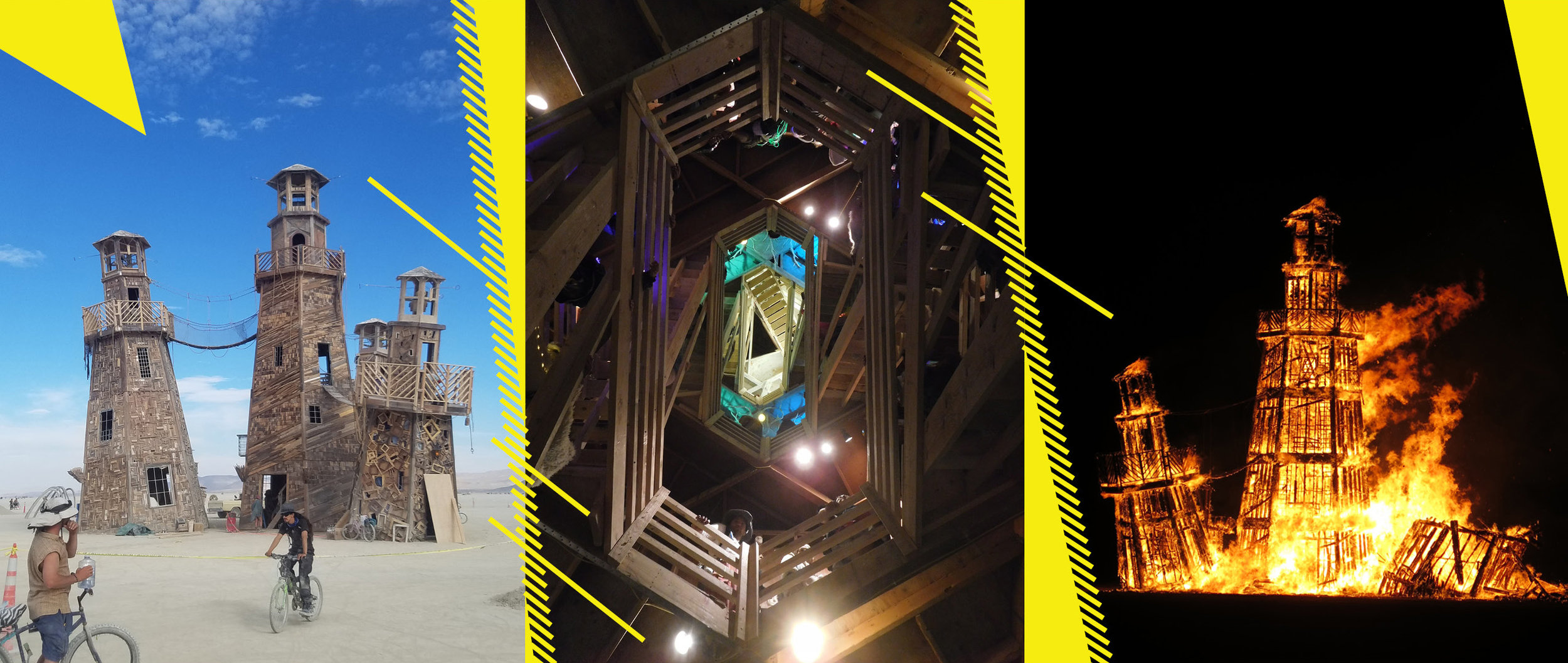
Burning Man is an annual congregation of artists, creators, and dreamers that takes place in the Nevada desert. For a little over a week, the desert is filled with incredible art instalations, mobile dance parties, and themed events throughout the campgrounds where the participants stay. Burning man is a "leave no trace" event, so everything that is brought in must be taken out. For this reason, some of the larger structures and installations are designed and built so they can be burned at the end of the event. Notably, these structures have a grand architectural presence on the open desert, and reveal some interesting techniques about wood construction. The grand scale and construction details are even more impressive when realizing the 1-2 week timeline for errection of the structures, before they are reduced to a pile of ash. Below are 3 structures from this year's Burning Man, showing their exterior, interior, and the final burn.
-Xander Tertychny
Lighthouse of Black Rock City
The Temple
Catacomb of Veils
FAREWELL VIKTORIA!
Today we send off our extremely talented and determined intern Viktoria Schoblocher. She is returning to Germany to finish her architectural degree and we could't be happier with the hard work she put in here at JSA.
-JSA
KITCHEN FOR THOUGHT
Whether for practical reasons, cost-effectiveness or comfort, kitchens end up looking a lot like... well... every other kitchen. For a space that very often opens up to other areas of the home in which both amateur chefs and seasoned cooks spend a lot of time, kitchens ought to be considered a living space in their own right. Whether minimalist (islands built on legs), mid-century inspired (yellow and teal accents), driven by materials (blonde woods), or more decorative accents (bright colors and/or art); let these kitchen designs feed your imagination.
#kitchen #cuisine #Küchen #cucine #cocinas
Source/designers: Camilla Miehe Renard; Cesar; Henry Built; Cesar
Source/designers: unknown(Pinterest), We Do Wood, Doherty, Turbulences Déco, Kennedy Nolan
Source/designers: unknown(Pinterest), Studio Four, unknown(Pinterest), unknown(Pinterest)
Vignettes by: Notch, Carom, unknown(Pinterest), Apostoph9, Sarah Jayne
-Emmanuel Cobbet
CONSTRUCTION MANDALA #1
A mandala is a Hindu or Buddhist graphic symbol which represents the universe, usually in the form of a circle divided into four separate sections or bearing a multiple projection of an image.
The act of viewing or making one is considered to be highly meditative. I stumbled across the geometry involved while making repetitious collages out of one image, noting that while I was working I felt collected. After some research I found that what I was doing was in fact something human beings have been doing for thousands of years.
I am constantly on the lookout for interesting shapes, colors, textures, contrasts, and lighting to make a mandala with and shooting progress shots of JSA’s projects gives me many opportunities for this.
-Chris Sowers


